I've been tinkering with the blog again. Honestly, I can't help it.
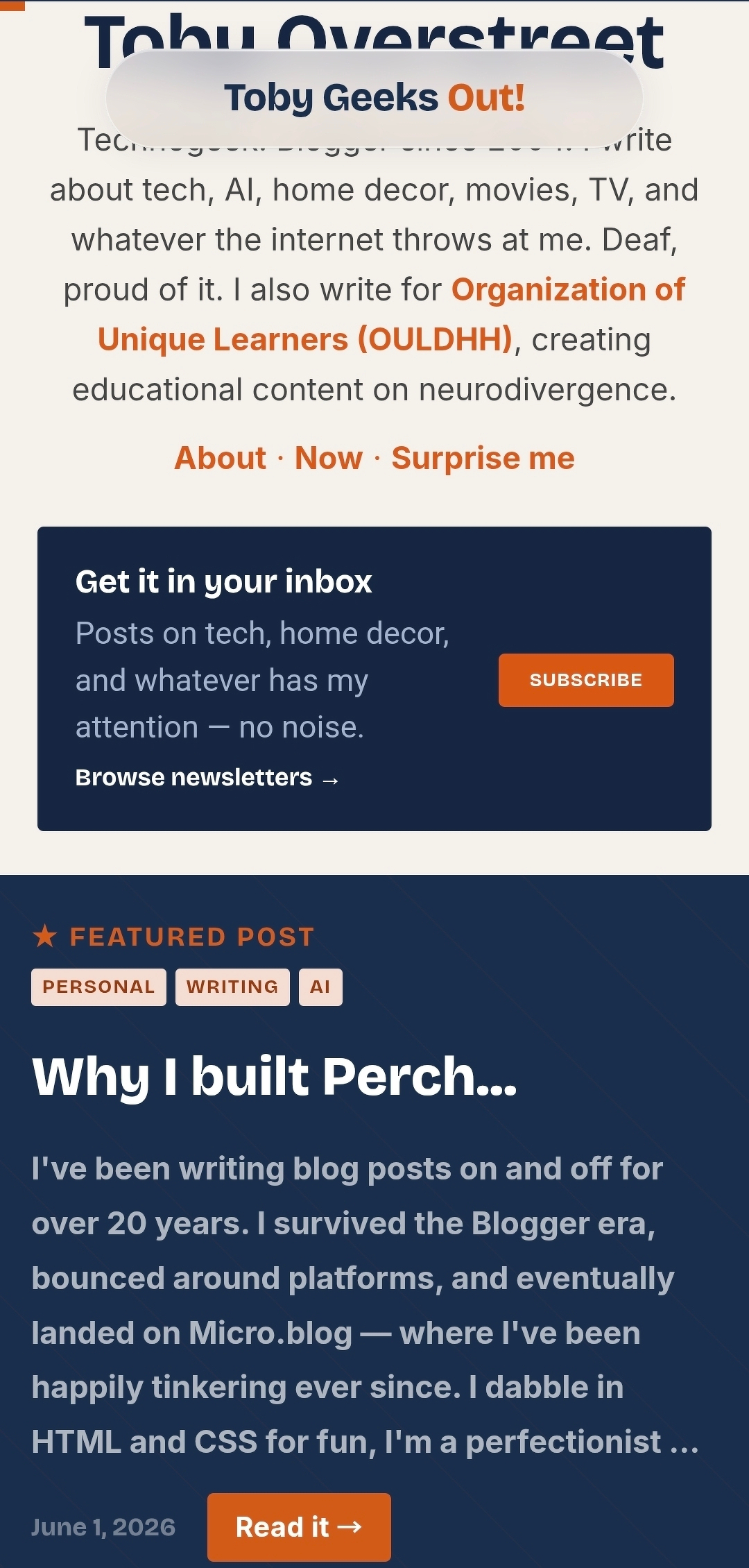
The biggest change is the header. As you scroll down, it collapses into a floating pill — clean, minimal, just "Toby Geeks Out!" sitting at the top of the screen. The inspiration came from glass.photo, which has one of the slickest pill header treatments I've seen. I loved it so much I had to bring that energy here. It's also very much iOS-inspired — that Liquid Glass feel Apple has been leaning into lately felt right for what I was going for.
I also added a scroll-to-top button. Tap it and it sends you back to the top of the page. Still tweaking how it behaves — it's a work in progress — but the bones are there.
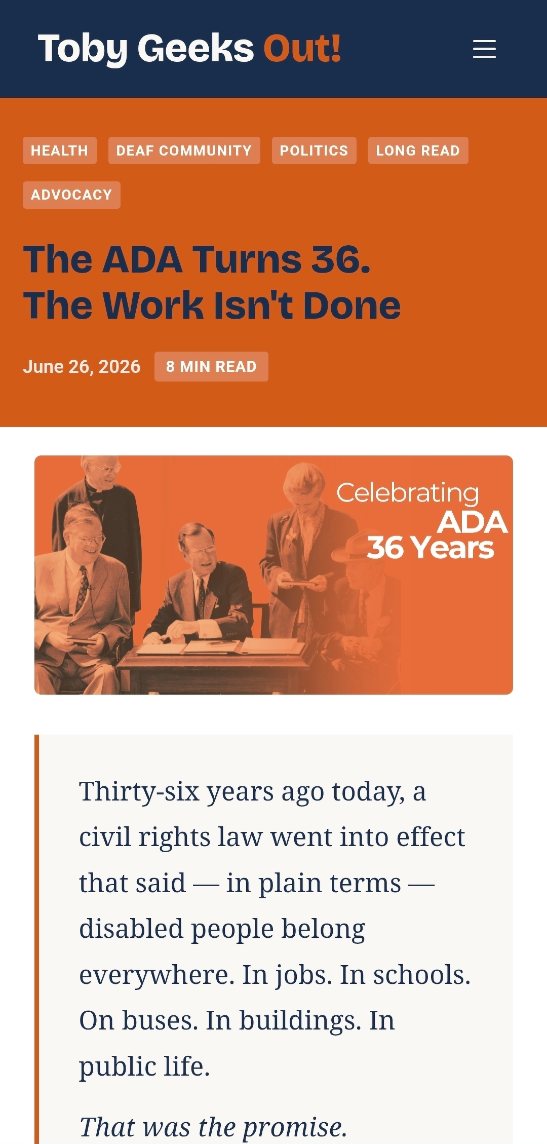
The overall look got a refresh too. The single post header is one I'm still actively rethinking — I have ideas but nothing locked in yet. I'm keeping what's there for now while I look around for inspiration and figure out the direction I actually want to go. Some design decisions need to sit for a while before they become obvious.
More tweaks are coming. They always are. But this one feels good.
If you notice anything wonky or have thoughts on the direction, I'd love to hear it.