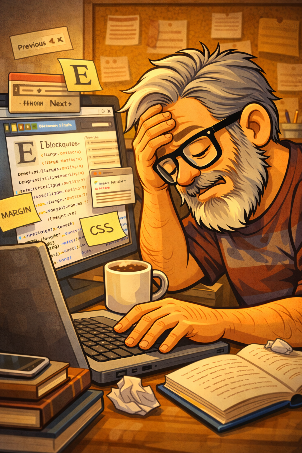
So I spent my Sunday doing what normal people probably don’t do—obsessing over blog spacing. You know how it is. You notice one little thing that’s bugging you, and next thing you know, three hours have disappeared, and you’re still messing around with CSS.
It started with my blockquotes. I’ve got this dropcap thing going on for the first letter of posts, which I think looks pretty cool. But when a blockquote showed up right after that fancy first letter? Huge, awkward gap of white space. Just looked weird.
So I tried adjusting the dropcap’s line-height first. Then I messed around with margins—positive, negative, whatever I could think of. Nothing worked until I finally stumbled on the magic combo: negative margins on the blockquote itself, plus zeroing out the padding. And boom, fixed.
While I was in there anyway, I gave the blockquotes a little makeover. Switched the font to Georgia with italics. It’s got that slightly fancy, bookish vibe without being too much. Made the text bigger too so the quotes actually stand out.
I also tweaked the previous/next post navigation at the bottom of the pages. Made those links bold, colored them with my accent color, and added underlines when you hover over them. Just a few little touches to make everything feel more polished.
Here’s the funny part, though: I kept thinking the navigation font looked weird in Firefox compared to my other browser. Spent way too long trying to fix it with CSS. Turns out? Firefox’s font setting was on “Large” instead of “Medium.” Facepalm moment. 🤦♂️🤷♂️
But hey, that’s the fun of tinkering with your own site, right? You can spend a whole afternoon tweaking tiny details that probably only you’ll notice, and somehow it’s completely worth it.