The past few weeks have been less about writing posts and more about building the thing that holds them. If you’ve visited the blog recently and noticed things looking a little sharper, a little more intentional — that’s not your imagination. I’ve been deep in the code, and I want to tell you what that actually looked like.
It Started With One Thing and Became Twenty
That’s always how it goes, isn’t it? I went in wanting to clean up a small layout inconsistency, and three weeks later I had touched nearly every part of the theme. CSS sections, Hugo templates, JavaScript, mobile layouts — all of it got some attention. Not because anything was broken beyond fixing, but because once you start looking, you can’t stop seeing what could be better.
The biggest structural change was collapsing two redundant card components into one. The blog feed used to have a micro-card for short posts and a post-card for longer ones — two separate chunks of code doing almost the same job. I merged them into a single unified card with simple logic inside: if a post is over 800 characters, it shows a truncated summary with a “Keep reading” link. Under 800, it shows everything. Same visual design, half the code. That kind of cleanup feels good in a way that’s hard to explain to non-developers, but if you’ve ever reorganized a messy drawer and felt the satisfaction of it — it’s that.
The TOC Fight
One of the more satisfying fixes involved the Table of Contents sidebar on Long Read posts. It had been working, then stopped, and I couldn’t figure out why. The TOC is supposed to stay sticky as you scroll — following you down the page, highlighting each section as you reach it. It wasn’t doing that anymore.
After a lot of digging, I found the culprit: Grammarly. The browser extension was injecting overflow: hidden onto the page body at runtime, which silently broke position: sticky on the sidebar. One line of CSS fixed it — I forced the body to allow vertical scroll regardless of what extensions try to inject. Took a while to find, took a second to fix. That’s debugging in a nutshell.
Mobile Got a Real Rethink
I spent a good chunk of time thinking hard about the mobile experience. The blog was sitting at 56% on PageSpeed Insights, and I wanted to push that number up. Some of it was technical — moving the Splide.js carousel off the top of the page and down between the About Me blurb and Recent Geeksouts, converting images to WebP format, and making sure every image has proper alt text for accessibility. Some of it was design.
Honestly though, the performance score didn’t budge much. A lot of what’s dragging it down is baked into how Hugo builds on Micro.blog — stuff I simply don’t have control over. So I made peace with it. I loaded the blog on my phone — a newer, high-end device — and it runs beautifully. The tradeoff I’m aware of is that people on older, aging devices might have a different experience. That’s something I’ll keep an eye on.
The feed layout on mobile used to have the post date in a column on the left, with the post content on the right. It worked, but on a small screen it was eating up real estate. I dropped it and switched to a stacked editorial style — date above, content below — which gave the text more room to breathe. I also discovered that iPhone Safari and Android Chrome render fonts very differently, and had to add a specific CSS block just to tame the iPhone sizing without breaking how good it already looked on Android.
I tested across Brave, Safari, Orion, Comet, Arc, and Chrome — the browsers I use most often. Everything looks good on both mobile and desktop. The one exception is Comet and Arc on my Samsung Galaxy Z Fold 7 when unfolded — there’s a header nav issue and some unexpected white space on the right side that the other browsers don’t have. Still investigating why. The rest of the browsers handle it beautifully, so it’s a quirk worth chasing down rather than a crisis.
Little Things That Add Up
Beyond the big structural stuff, a lot of small things got fixed or refined:
The blockquote style got unified across every context on the site — feed, single post, static pages — so it always looks the same no matter where it appears. Warm terracotta background, deep rust border, Georgia italic. It’s a small detail but it matters.
The homepage search bar got taller and wider — more inviting, easier to tap on mobile. The subscribe section got a proper card layout. The footer on short posts now shows a permalink instead of a redundant date. The category pills lost the wavy underline that Micro.blog’s own CSS was injecting over my styles.
The Reading page got some love too. The bookshelf got a visual overhaul — compact cover cards with title and author, styled consistently with the rest of the site. I even added a fake wood shelf underneath the currently reading section, which sounds a little silly but looks fantastic. It’s a much nicer way to show what I’m currently reading than a plain list.
The Now page got a full redesign — a navy card for what I’m currently tinkering with, arrow-style lists for writing links, a bookshelf section for what I’m reading, and an auto-updating Long Reads block so I never have to update it manually again.
And “Recent Posts” became “Recent Geeksout." Because obviously.
Rethinking the Homepage Order
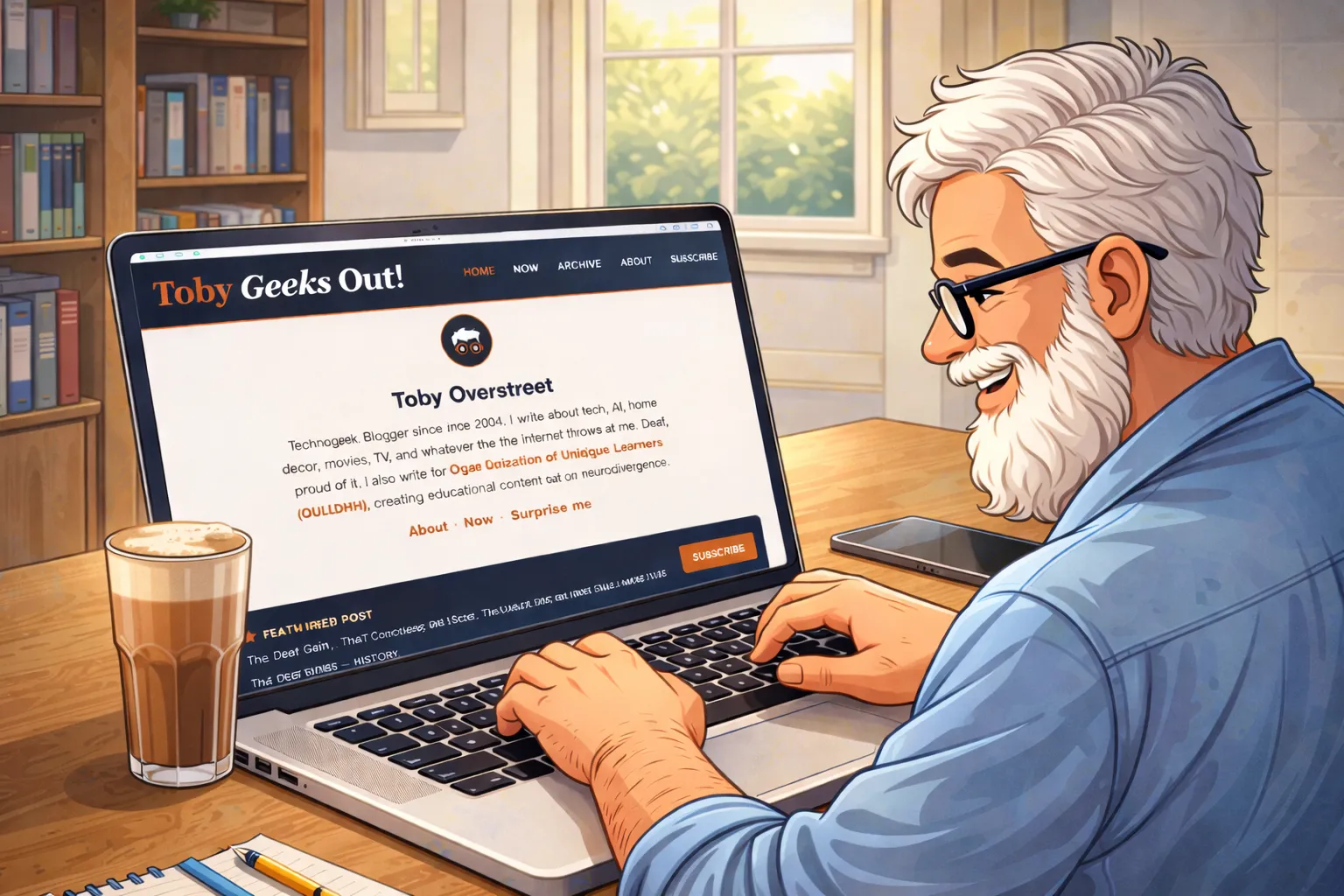
I also reorganized the homepage layout. It used to open with the featured post, then my About Me blurb, then the subscribe strip, then the recent feed. It made sense at the time, but it always felt like the featured post was grabbing attention before readers even knew what the blog was about.
So I flipped it. Now the homepage opens with the About Me section, followed by the subscribe strip, then the featured post, then the recent feed. It’s a small reorder but it changes the feel significantly — you get context first, then content. New visitors know who I am and what this place is before they dive into anything. It just makes more sense.
What’s Next
The theme is in a good place right now. There are always small things to revisit — there’s a Browse by Topic spacing issue that keeps evading me, and I want to keep watching how the “Keep reading” truncation performs across different post types. But the tinkering never really stops. I’ll keep poking at the HTML and CSS, making this a more enjoyable reading experience one small improvement at a time.
If you’ve landed on the homepage and have thoughts about how it looks or reads, I’d love to hear from you. Seriously — drop me a note. Feedback from actual readers means a lot.